Living Room Decor Colors set the tone for your space, creating a cozy retreat or a vibrant social hub. Choosing the perfect palette involves balancing personal style, lighting, and furniture. Whether you love soft neutrals for a timeless look or bold hues for a statement, the right colors can transform your living room into a stylish and inviting space. Let’s explore how to find the perfect shades for your home!
Why Choosing the Right Living Room Color Scheme is Essential
When it comes to transforming your living space, the importance of living room colors cannot be overstated. The right color scheme not only enhances the aesthetic appeal of your home but also plays a crucial role in setting the mood and atmosphere. Understanding color psychology is key to making informed decisions about your decor colors, as each hue can evoke different emotions and reactions.
For instance, warm tones like reds and oranges are known for their energizing effects, perfect for creating a lively and inviting space. On the other hand, cool shades such as blues and greens can instill a sense of calm and tranquility, ideal for unwinding after a long day. By strategically selecting your living room colors, you can craft an environment that aligns with your desired mood.
Moreover, the impact of colors extends beyond mere aesthetics; it influences how we feel in our surroundings. A well-thought-out color scheme can make your living room feel more spacious or cozy depending on your preference. It’s about finding that perfect balance that reflects both personal style and functional needs.
In conclusion, choosing the right living room color scheme is essential not only for its visual appeal but also for its ability to affect our emotions and overall well-being. By harnessing the power of color psychology, you can create a harmonious space that truly feels like home.
The Latest Trends in Living Room Decor Colors You’ll Love
When it comes to refreshing your home, there’s no better place to start than the living room. As we look ahead to 2025, the latest trends in living room decor colors are set to transform your space into a haven of modern style and comfort. Embracing these trending living room colors will not only keep your home up-to-date but also create an inviting atmosphere for family and friends.
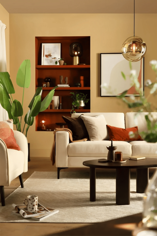
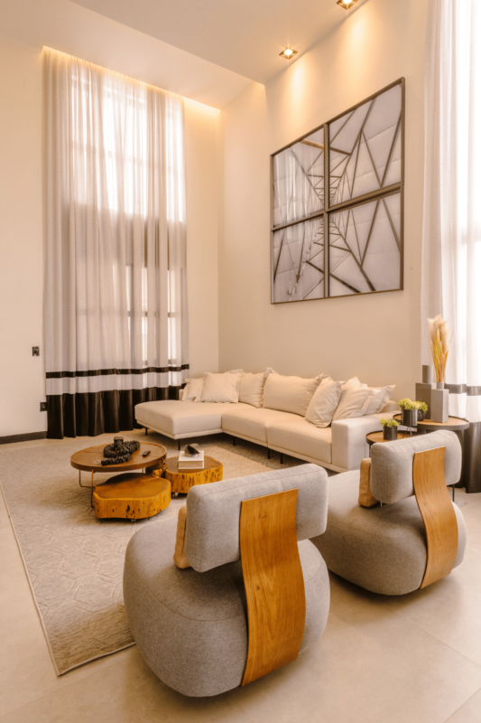
One of the standout modern color palettes for 2025 is a blend of earthy tones with vibrant accents. Think warm terracotta paired with rich teal or deep forest green. These popular home decor colors bring a sense of grounding and serenity while allowing you to add personality with bold pops of color through accessories or artwork.
Another trend gaining momentum is the use of soft pastels combined with natural textures. Imagine blush pinks, muted lavenders, and gentle sage greens harmonizing beautifully against wooden furnishings and organic fabrics. This palette offers a fresh take on minimalism, providing a soothing backdrop that encourages relaxation and mindfulness in your living space.

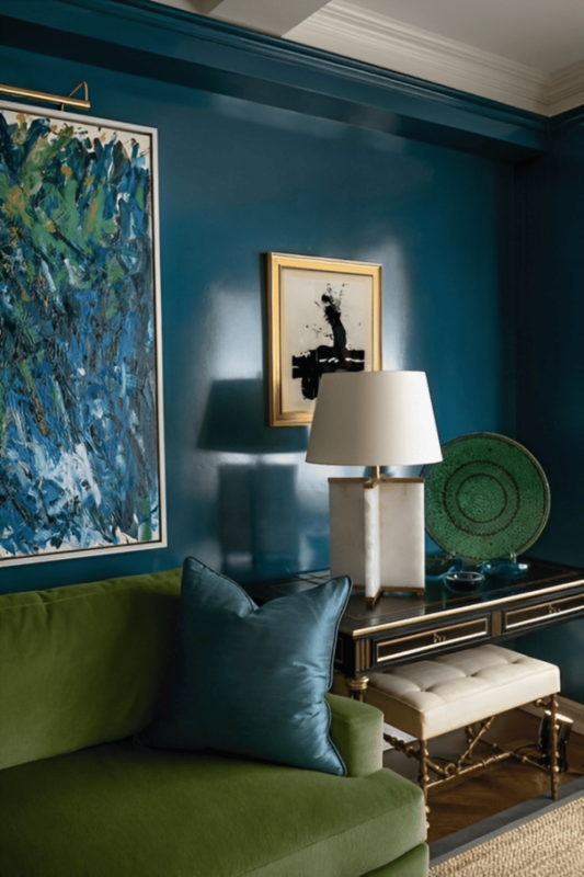
For those who prefer a more dramatic flair, jewel tones are making a strong comeback as part of the 2025 color trends for living rooms. Luxurious shades like sapphire blue, emerald green, and amethyst purple can be used as statement walls or accent pieces to add depth and sophistication without overwhelming the room.
By incorporating these trending living room colors into your decor scheme, you’ll be embracing some of the most exciting developments in interior design while ensuring that your space feels both contemporary and personal. So why not explore these captivating palettes today? Your perfect living room makeover awaits!
Understanding Color Psychology: How Different Shades Influence Your Mood and Style
Color psychology is a fascinating field that plays a pivotal role in home design, influencing our mood and style in ways we often overlook. Understanding the emotional impact of color choices can transform your living spaces into sanctuaries of calm or hubs of dynamic energy.
When it comes to calming shades for living spaces, colors like soft blues, gentle greens, and muted earth tones are renowned for their soothing effects. These hues create an environment that promotes relaxation and tranquility, making them ideal for bedrooms or meditation areas where peace is paramount.
On the other hand, if you’re looking to invigorate a room with energy and vibrancy, consider dynamic tones such as bold reds, vibrant yellows, or lively oranges. These colors can stimulate conversation and creativity, perfect for social areas like kitchens or living rooms.
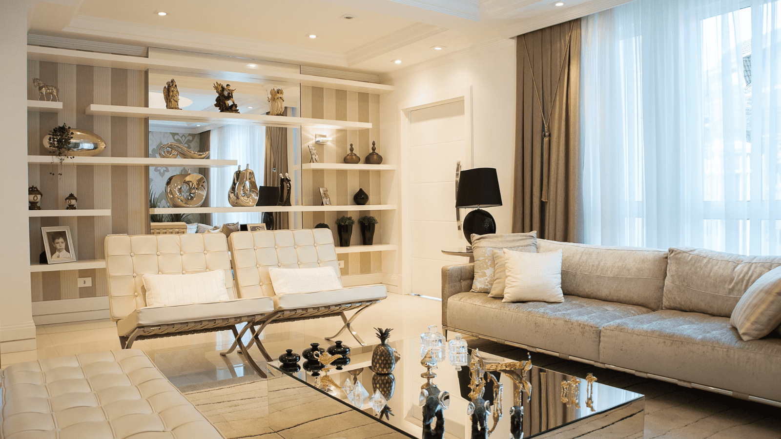
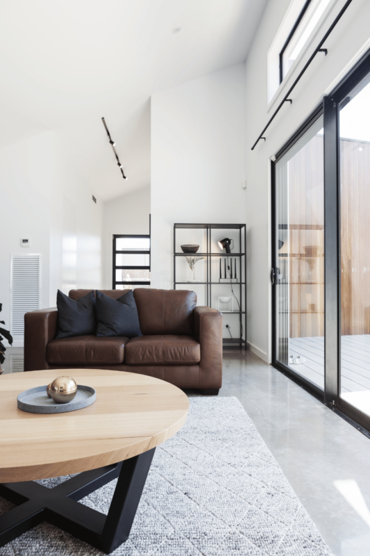
The choice between dynamic vs. neutral tones can also reflect your personal style and the atmosphere you wish to cultivate. Neutral tones such as grays and beiges offer versatility and sophistication while providing a blank canvas that highlights your decor’s features without overwhelming them.
By embracing color psychology in home design, you not only enhance the aesthetic appeal of your spaces but also positively influence the emotional well-being of those who inhabit them. So next time you’re considering a redesign or simply refreshing a room’s look, remember: your color choices have power far beyond mere decoration—they shape how you feel every day.
How to Choose a Color Palette that Complements Your Furniture and Accessories
Creating a harmonious living space is all about choosing the right color palette that complements your furniture and accessories. This process, while seemingly daunting, can be simplified with a few strategic steps that ensure your decor harmonizes beautifully with your existing furnishings.
Start by considering the overall theme or mood you wish to convey in your living room. Do you want it to feel serene and calming, or vibrant and energetic? Once you’ve established this, selecting complementary color schemes becomes more straightforward. For instance, if you’re aiming for a tranquil atmosphere, soft blues and greens paired with neutral tones can create a soothing effect.
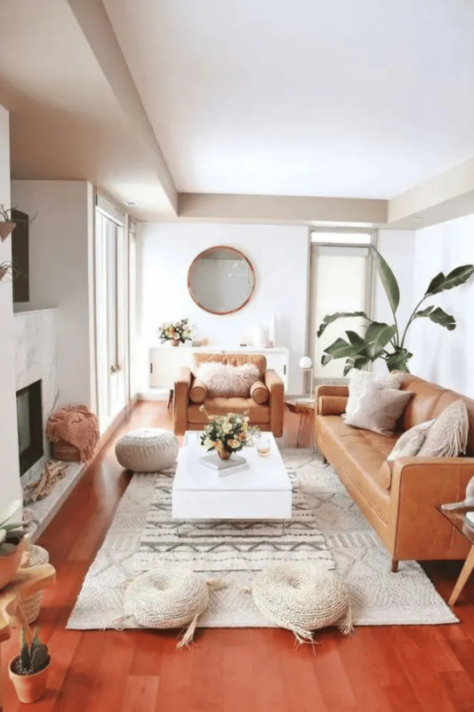
Next, take stock of your furniture pieces. Are they bold statement items or subtle background pieces? Matching decor with furniture involves identifying dominant colors in these pieces and finding complementary shades that enhance rather than overpower them. For example, if you have a navy blue sofa, consider incorporating accents of mustard yellow or burnt orange through cushions or throws to create an inviting contrast.
Cohesive living room design tips often highlight the importance of balance. To achieve this, utilize the 60-30-10 rule: 60% of the room should be a dominant color (often walls), 30% should be secondary colors (furniture), and 10% should be accent colors (accessories). This method ensures that no single element overwhelms another.
Finally, when it comes to accessory coordination tips, think about texture as well as color. Mixing materials like wood with metal or glass can add depth without clashing visually. By carefully selecting accessories that echo hues found elsewhere in the room—such as artwork featuring similar tones—you’ll tie everything together seamlessly.
By following these guidelines on choosing a color palette that complements your furniture and accessories, you’ll craft a cohesive environment that’s not only visually appealing but also perfectly aligned with your personal style.
Sneaky Tips to Create an Illusion of Space with Smart Color Choices
When it comes to transforming your small space into a more expansive haven, the power of paint should not be underestimated. By selecting the right space-enhancing colors and employing clever light reflection techniques, you can create an illusion of spaciousness that truly elevates your home.
One of the most effective strategies is to embrace lighter shades. Soft whites, pale blues, and gentle pastels are excellent choices as they reflect more light than darker hues, making rooms appear larger and airier. The magic lies in their ability to bounce natural light around the room, creating a bright and open atmosphere.
Another tip is to use a monochromatic color scheme. By painting walls, trim, and ceilings in different shades of the same color family, you can blur boundaries between surfaces. This technique minimizes visual breaks and enhances continuity throughout the room.
Don’t forget about accent walls! A strategically placed accent wall in a slightly darker shade can add depth without compromising on openness. Just be sure it complements your primary color palette to maintain harmony.
Harnessing these smart paint choices will not only amplify your space but also transform it into an inviting retreat that feels much larger than its actual dimensions. So go ahead—pick up that paintbrush and start creating an illusion of grandeur with colors that work for you!
Avoid These Common Mistakes When Selecting Living Room Decor Colors
When it comes to decorating your living room, choosing the right color palette can make all the difference between a harmonious space and a disjointed one. Avoiding common mistakes in selecting decor colors is crucial for creating an inviting and stylish atmosphere. One of the most frequent pitfalls is clashing palettes, where mismatched hues create visual chaos rather than cohesion. To prevent this, consider using a color wheel to identify complementary shades that work well together.
Another mistake to steer clear of is the overuse of bold shades. While vibrant colors can add energy and personality to your living room, too many bold tones can overwhelm the senses and detract from the overall design. Instead, use bold colors sparingly as accents or focal points against a more subdued backdrop.
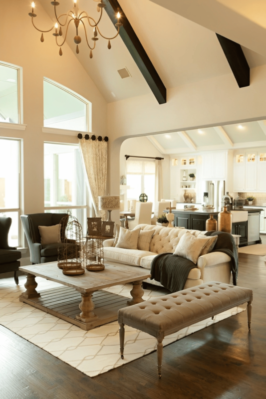
Equally important is maintaining balance in your decor colors. A lack of balance can lead to an uneven look that feels either too busy or too sparse. Aim for a mix of light, medium, and dark tones throughout the space to achieve visual harmony.
Lastly, beware of excessive neutrality. While neutral tones are timeless and versatile, relying solely on them can result in a bland environment lacking character. Introduce subtle pops of color through accessories like cushions or artwork to inject life into your living room without sacrificing sophistication.
By avoiding these common mistakes—clashing palettes, overuse of bold shades, lack of balance in decor colors, and excessive neutrality—you’ll be well on your way to curating a beautifully cohesive living room that reflects both style and comfort.
The Ultimate Guide to Experimenting with Bold and Neutral Tones Harmoniously
When it comes to transforming your living space, the art of blending bold and neutral tones can create a stunning visual impact that is both adventurous and tasteful. Safely using bold living room paints involves more than just picking a vibrant color; it requires a strategic approach to balance these daring hues with subtle undertones.
Start by selecting a bold color that speaks to your personality—perhaps a deep teal or rich mustard. These shades can serve as captivating focal points when applied to an accent wall or incorporated through statement furniture pieces. The key is balancing these vibrant choices with softer, neutral elements like creamy whites, soft grays, or muted beiges. This contrast not only prevents the space from feeling overwhelming but also highlights the bold tones, making them pop even more.
Mixing neutrals effectively in your design scheme ensures that the bold colors remain grounded and cohesive. Consider layering different textures and materials in neutral shades—think plush throws, sleek metallics, or natural woods—to add depth without detracting from the overall harmony of the room.
Experimenting with color doesn’t have to be daunting. By thoughtfully combining vibrant hues with understated neutrals, you can achieve an adventurous yet tasteful design that reflects both elegance and creativity in your home’s aesthetic.
Conclusion: Elevate Your Home’s Aesthetic by Mastering the Art of Living Room Decor Colors Today!
In the realm of interior design, mastering the art of living room decor colors is your ticket to transforming a mundane space into a vibrant sanctuary that reflects your personality and style. Imagine walking into a room where every shade and hue has been carefully curated to create an atmosphere that is both inviting and inspiring. By understanding color theory and experimenting with different palettes, you can craft a living room that not only stands out but also feels like home.
Colors have the power to influence mood, evoke emotions, and even affect perceptions of space. A well-chosen color scheme can make your living room feel more spacious, cozy, or energizing—depending on what you’re aiming for. Whether you prefer the calming effect of cool blues and greens or the warmth of rich reds and oranges, there is a perfect palette waiting for you to discover.
Don’t underestimate the impact that thoughtfully selected decor colors can have on your home’s aesthetic appeal. By taking control of this element in your design process today, you’ll be able to elevate not just your living room but also enhance the overall ambiance of your entire home. Embrace this opportunity to express yourself through color and watch as it breathes new life into your surroundings. Take action now—your dream living space is just a few swatches away!
>> Learn more: How to Incorporate Natural Materials in Organic Modern Style?